Photography composition rules, and when to break them
Nine photography composition rules, from the rule of thirds to the golden ratio: what each one does, how to use it, and when breaking it works better.
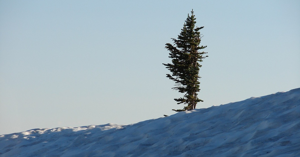
Photography composition rules steer the eye: where it lands first, where it travels and where it stops. The ones worth knowing are the rule of thirds, leading lines, framing, symmetry and patterns, negative space, filling the frame, horizon placement, point of view and the golden ratio. They work on a phone or any other camera. None is a law, so each comes with what it does and a concrete case for breaking it.
1. The rule of thirds
Divide the frame with two horizontal and two vertical lines into nine equal boxes, then set the subject along one of the lines or where two meet. Many cameras and phones can show the grid; the iPhone steps are in how to take better photos on iPhone.
What it does. An off-center subject leaves room for what else matters: the setting, where someone is looking, the road a cyclist is heading into.
Where it comes from. The English draughtsman John Thomas Smith gave it its name in his 1797 book Remarks on Rural Scenery, where he proposed calling it the "Rule of thirds". Writing about landscape, he suggested giving the sky about two-thirds of a picture or about one-third, which he found more harmonious than "the precise formal half".
Break it when the subject is symmetrical or faces you head on: a face looking into the lens, a doorway, a round flower from above. Break it for tension, too. Leave the empty space behind a moving subject instead of ahead, and it reads as leaving rather than arriving.
Nor is the grid proof of a good photo. In a 2014 study in Art & Perception, aesthetic ratings tracked only weakly with whether viewers judged a photo to follow the rule, and the authors concluded it seems to play "only a minor, if any, role" in large sets of high-quality photographs and paintings.
2. Leading lines
Roads, fences, shorelines and rows of trees pull the eye along them, and lines that converge into the distance add depth. Start one near a bottom corner and let it run toward the subject. Adobe's guide warns against lines that lead nowhere, so make sure something waits at the end.
Break it when the line is the subject. A switchback road seen from a lookout or a spiral staircase from below needs no destination. Let the shape fill the frame and run off the edges.
3. Framing
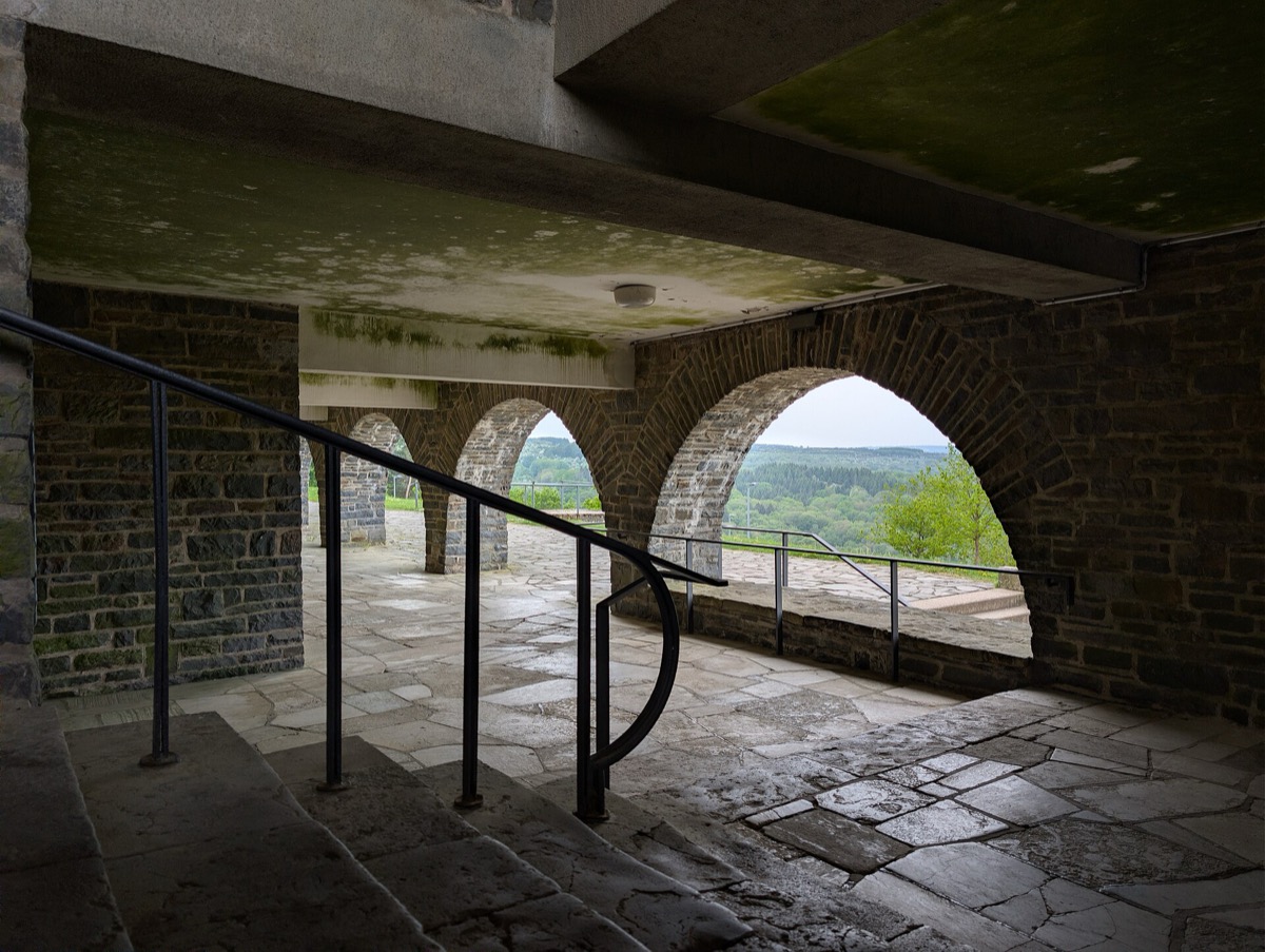
Shoot through a doorway, an arch, a window or a gap in branches. The National Park Service's beginner's guide describes framing as using other things in the scene to frame the subject. It hides clutter at the edges, points inward and adds a layer of depth.
Break it when the frame starts to win. If the arch is brighter or more detailed than the view through it, it's the subject now: make it the picture or step through it. A partial frame, such as a soft blur of leaves across one corner, can make a photo feel found rather than arranged.
4. Symmetry and patterns
A building's front, a bridge or a long corridor feels calm and deliberate when it mirrors itself, and this is where the center beats the thirds. Nikon's composition guide notes that repeating patterns and textures draw the eye. Stand exactly on the center line and keep the camera level and square to the subject, or parallel lines start to converge and the mirror breaks.
Break it when the scene is almost symmetrical but not quite. A subject slightly off center looks like a mistake, so commit to the thirds. A pattern, meanwhile, is a stage for its exception: one yellow umbrella among black ones, one empty seat in a full row.
5. Negative space
Negative space is the empty part of the frame: sky, still water, fog, snow, a bare wall. It isolates the subject, sets a quiet mood and balances a small subject placed to one side, a use both Adobe's and Nikon's guides describe.
Break it when the space adds nothing. A flat gray sky or a blank parking lot only makes the subject look lost. If the emptiness carries no mood or context, crop in or walk closer.
6. Fill the frame
Move closer until the subject reaches the edges or runs past them. With nothing else to look at, the eye stays put, and detail such as texture or an expression becomes the picture. Nikon's guide adds that filling the frame can hint at what lies beyond it.
Break it when the place is the story. A baker in a busy kitchen or a climber small on a rock face says more with the surroundings than in close-up.
7. Horizon placement
Smith's 1797 advice still holds: set the horizon about a third of the way from the top or bottom, not across the middle, where it cuts the picture into equal halves. Give the sky two-thirds when the clouds are doing something, and less when the interest is below. Keep it level: a slight tilt looks like an accident, so use the camera's level or straighten it later.
Break it when the scene holds a reflection. On still water, a centered horizon completes the mirror, and that symmetry is the picture. A horizon can also sit at the very edge when only the sky or only the ground matters, and a strong tilt can add energy if it's plainly on purpose.

8. Point of view
Most photos are taken standing, at eye level. Adobe's guide suggests changing perspective: low or high, close or far. A low angle makes a subject loom and can swap a busy background for sky; a high one flattens a scene into shapes and makes a subject look smaller.
Break it when you want things to look the way people see them. A plain, straight-on view from standing height adds no drama, which suits a series meant for comparison, such as a row of storefronts or one tree every month.

9. The golden ratio, and how contested it is
The golden ratio is about 1.618 to 1: two lengths are in it when the longer divided by the shorter equals their sum divided by the longer. Euclid defined it around 300 BC as dividing a line in "extreme and mean ratio". In photography, a phi grid splits the frame like the thirds grid, with its lines closer to the center. A golden spiral tightens toward one point, where the main subject goes, and the spiral itself works as a curved leading line.
The honest note. The claim that it's the most beautiful proportion rests on thin evidence. In the 19th century, the German physicist and psychologist Gustav Fechner asked people to pick the most pleasing of ten rectangles, and their choices peaked at the golden rectangle. In 1974, Michael Godkewitsch concluded that the preference came from where the golden rectangle sat among those shown; in 1980, Chris McManus found moderately good evidence for it. Careful tests have been inconclusive at best. Claims that the Parthenon follows the ratio have largely been discredited, and no documentation shows that Leonardo deliberately used it in the Mona Lisa. In a 2002 essay for Plus Magazine, Mario Livio argued it should be dropped as a universal standard of beauty.
Break it when it gets in the way. Adorama's guide says the phi grid gives only a slightly different effect from the thirds grid, and that choosing between them is mostly personal preference.
Frequently asked questions
What are the basic rules of composition in photography?
The core set is the rule of thirds, leading lines, framing, symmetry and patterns, negative space, filling the frame, horizon placement, point of view and the golden ratio.
Who came up with the rule of thirds?
The name comes from John Thomas Smith, who proposed it in his 1797 book Remarks on Rural Scenery and applied it to landscape, such as how much of a picture to give the sky.
Is the golden ratio better than the rule of thirds?
There's no good evidence that it is. Studies of whether people prefer golden proportions have been inconclusive, so use whichever grid helps you compose.
When should you center the subject?
When the scene is symmetrical, when the subject looks straight into the camera, or when nothing else in the frame needs room. A reflection on still water is the classic case.
Start Pics Please
A weekly photo contest: pitch the theme, shoot the challenge, and see who won and why at the weekend.
Psst is invite-only. Sign up with code PICSPLEASE
Scan with your iPhone / Download Psst
Psst is invite-only. Sign up with code PICSPLEASE
Sources
- Remarks on Rural Scenery (John Thomas Smith, 1797), full text at the Internet Archive
- Smith, John Thomas (1766-1833) (Dictionary of National Biography, 1885-1900, at Wikisource)
- Rule of thirds
- Evaluating the Rule of Thirds in Photographs and Paintings (Amirshahi, Hayn-Leichsenring, Denzler and Redies, Art & Perception, 2014)
- The basics of photography composition (Adobe)
- Essential composition techniques (John Bogna, Nikon, 2025)
- Beginner's Photography Guide (National Park Service)
- The golden ratio and aesthetics (Mario Livio, Plus Magazine, 2002)
- Golden ratio
- What Is the Golden Ratio in Photography? (Peter Dam, Adorama, 2024)
- Golden Ratio Photography: Grids, Spirals, and Composition Tips (Ester Dobiášová, Zoner, 2026)
- Lone tree above snow field (Wikimedia Commons file page)
- Archway view overlooking the Urft Valley at Vogelsang (Wikimedia Commons file page)
- Stanton Mountain reflected in Lake McDonald (Wikimedia Commons file page)
- Worm's-eye view of a tree at Myrstigen (Wikimedia Commons file page)


